or use the SITEMAP
6 ways to wear Spring colors
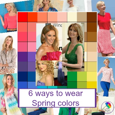
Ok so you’re a Spring – but how do you actually begin to wear Spring colors?
What does that mean, beyond a terrifyingly bright palette and, at first glance, very few neutrals? How do you begin dressing in your colors and looking fabulous?
As many of us know, this is when panic sets in. So many consultants determine your color palette and leave you with no idea where on earth to begin.
Time for clarification - a step by step guide!
So it's time for a bit of clarification and a step by step guide!
First of all forget all about whether you are LIGHT, WARM SPRING or CLEAR SPRING, that just causes frustration and dilutes your palette. If you're a TRUE SPRING you need all these color variations to do you justice.
Slow down - these are your colors!
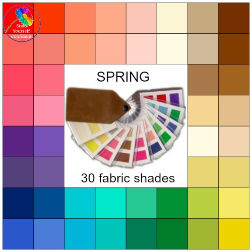
You have the brightest of the Seasons, and in many ways it can be the most difficult. But before you panic, slow down and have a thorough look at the colors.
Rather than looking at the whole wallet at once, look at one color at a time and I'll bet you find a few favourites in there - perhaps the color of a t-shirt or a jumper which always gets you compliments. This is reassuring - these are your colors!
Every color in the Spring palette has a warm or yellow undertone - there's almost a golden glow.
Your pinks are all slightly peach or coral toned, your greens are leaf and lime, your blues have an aqua hue and even your beige has the warmth of camel rather than being a cold stoney shade.
So how to begin putting them together for an outfit? When you look at the images below you'll see that there is probably nothing different to the way you would normally wear your clothes. Over thinking can complicate - just enjoy!
1 Just go neutral!
Whether you like sophisticated or natural – just go neutral!
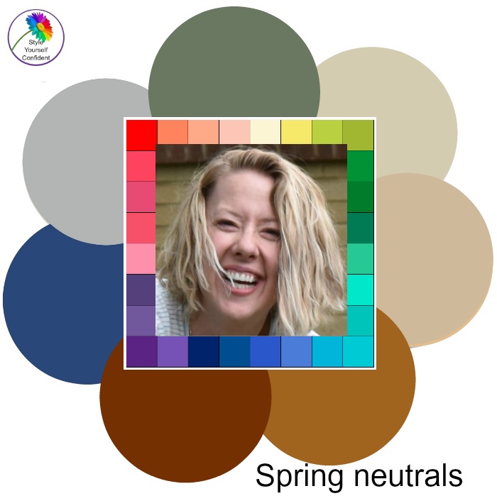
Your days of elegant sophistication don't need to be over because in the midst of the brights are a whole raft of classicly stylish neutrals.
Contrasting tones of pale grey, bright navy, denim blue, cream, palest shell pink, rich chocolate and camel. Wear them in beautiful fabrics to reflect the light and add instant sophistication. A camel jacket or cardigan, or a cream silk shirt can be the most useful items in your wardrobe.
A combination of denim and camel is always a winner, add soft white for a sharp contrast. Want to stay with blues then a variety of tones will pull the look from boring to
stylish. The monochromatic beige and cream with a barely there shell pink oozes luxury!
Keeping colors to a minimum then don't underestimate
the power of a bright lipstick or nail polish for a splash of color.
2 Starting with color
Want to step up from neutrals then the easiest way is to try two neutrals and one brighter color to create instant magic. Try navy and off white or beige as your neutrals, add your splash with a scarf, t-shirt or jacket.
Stripes always add a crispness. Or add your dash of color on the bottom half with a skirt or pants. It’s a really easy starting place which can be as classic or daring as you choose to make it based on your own personal style.
3 Ready for more?
Don't be afraid of wearing color from top to toe. A bold clear red dress topped with a camel or navy jacket keeps the look slick.
As long as you begin with a neutral you can safely add two splashes of color for slightly more impact. Try navy with coral
pink and turquoise or lemon and turquoise; gentle light camel with bold stripes, mid blue with a striking print scarf; they all add a bit more pizazz without needing sunglasses!
Accessories are your friend, enjoy introducing some fun colors with a scarf or bag.
The important thing to remember is that whether your look is classic, sporty, girly, outdoorsy or romantic, you can achieve any look you want to – you can choose to wear your Spring colors from a complete spectrum.
4 Wearing Spring colors in prints
Wearing a print may be an easier way to mix colors. But what if you're looking at a print and some of the colors don't appear to be in your palette?
As a rule of thumb, if the style is perfect and the majority of the colors are 'your colors' then trust your judgement. Hold your color swatch over the print and unless any of the colors really 'shout' then it will work. Just a splash of the wrong pink for example isn't going to detract from a great print.
Avoid your worst colors such as black, sludge green and mauvey pinks, they can all look a bit dull and dreary and will detract from your overall brightness.
Kettlewell Colours do some really pretty prints that have been carefully selected to fit entirely within your Spring palette.
5 Does everything I wear need to match my palette?
Color shouldn't be inflexible but, certainly, you need to think initially about the colors that surround your face. That's your tops, tees, scarves and jumpers, and getting the makeup colors that flatter your skin tone; all these will really will make your skin and eyes sparkle and bring you to life.
Long term, if you aim for the colors in your color swatch you'll achieve an effortlessly easy mix and match wardrobe. It doesn't need to be a massive changeover, just gradually replace clothes with better colors as they wear out or budget allows. Accessories are your friend and you can add splashes of color to an otherwise neutral outfit.
6 Wear Spring colors but still feel like YOU!
It's important, once you've found your color palette, that you still feel like YOU!
Color Analysis is not the old inflexible and rigid tool it once was and a color swatch is only the beginning. Don't get too fixated on matching an elusive shade that you forget your own taste and own personal style.
Most people find instinctively that your color palette will include lots of your favorites and you can afford to take your time and enjoy the process.
Easy ways to begin...
Easy ways to begin:
Most of all have FUN!
Homepage >> Spring Color Analysis >> How to wear Spring colors

