Identifying colors from a Fabric Swatch
by Cynthia H.
(USA)
Happy New Year, Pamela--
I'm so loving my Bright colors! I notice that we must be rare--only a couple of us among the customers presented so far. It has been so much fun to look around my house and recognize that, by golly, I have been, completely unconsciously, decorating in MY colors! (As well as creating his home office and "man cave"--a pandemic project--in HIS Summer shades, again unintentionally.)
The swatches are fabulous and I can't imagine how one can do without those! The colors are so much more precise than the online palette and really clarify the differences between shades. The actual fabric show in a realistic, natural way that cannot be captured online--and everyone's computer or printer colors may show a bit differently.
So I have a question about colors in the palette online, vs your wonderful swatches; I'm one of those folks who likes to be super organized. The 45 swatch colors are numbered--THANK YOU! I want to align them with your box palette map, so I can print out that map to put in my dressing area, etc. Ideally I could match the numbered swatches with the palette, but they are organized differently and I haven't been able to quite figure it out.
Would it be at all possible to number the colored squares on the palette so we can do a colored printout? It wouldn't be useful to those without the swatches, but perhaps you might add the numbers to a palette available only to those of us who have purchased the swatches, or even provide it for an additional fee.
All food for thought--in your already busy world! Thanks for considering.
Cheers--
Cynthia Horen
PS: Feel free to edit/quote any of the above for your newsletter.
ANSWER
Hi Cynthia
Delighted to hear how pleased you are with the color swatches and yes, I get very few ladies with really clear Bright coloring.
I'm sorry to say that it's not possible to match the colored swatches with my digital images.
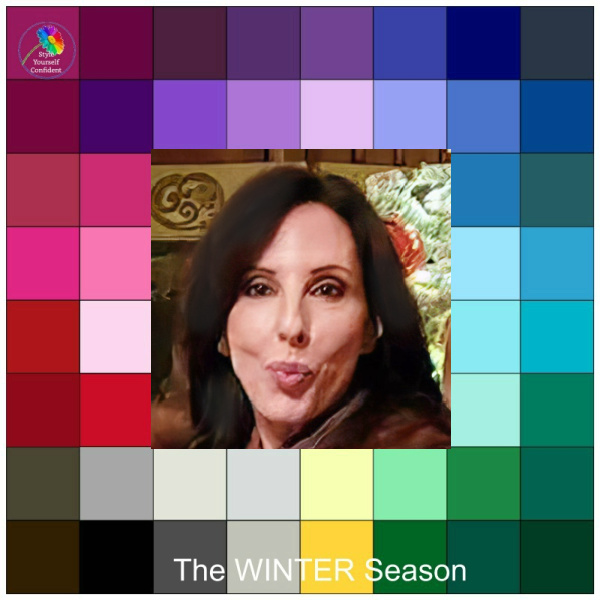
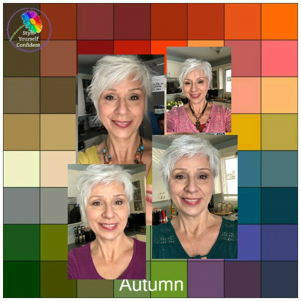
Digital colors are purely representational and as close as I can get and when there are 45 colors in your Bright swatch I have made it into 48 for the square image.
I suggest that you stick to your fabric swatch and learn to use it as a 'blending tool'. Don't get too hung up on an exact match, the colors just need the same characteristics and they will sit together very happily if they are a little lighter or deeper.
Take a look at How to use a Color Swatch to get the idea!
I have actually looked into the idea of transferring the colors into a more accurate color palette for Iphones but, to be honest, even my supplier of 'precision dyed' swatches won't commit to a Pantone code. So I'm afraid i've drawn a blank on that too.
I'm sure though that you will get the idea very quickly with the color swatches and your eye will become tuned!
kind regards
Pamela


